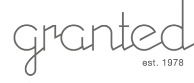
Our new logo?
We are planning to change our original logo.
Cutting edge, sleek, bold, futuristic, hover board... these are just some things that came to mind when we designed the new logo below.
Please let us know your thoughts.


Comments on this post (2)
Hi Cari This logo is kind of a spin/ spoof of the famous new GAP logo that was short lived due to its bad design. It was such a crummy design I had to make fun of it! Please read more of it here….
http://www.nj.com/shopping/index.ssf/2010/10/new_gap_logo_is_scrapped_after.html
— Minphis
I like the old one better. Please go back to that one.
Please?
— Cari S.